Python包matplotlib画图入门,以折线图为例。
在使用之前,导入matplotlib包,设置中文字体
import matplotlib.pyplot as plt
%matplotlib inline
plt.rcParams['font.family'] = ['Microsoft YaHei']
plt.rcParams['axes.unicode_minus'] = False
PS:关于matplotlib画图中文无法显示的问题请参见我的另一篇博文:ubuntu16.04中解决matplotlib画图中文无法显示问题
以折线图为例入门matplotlib
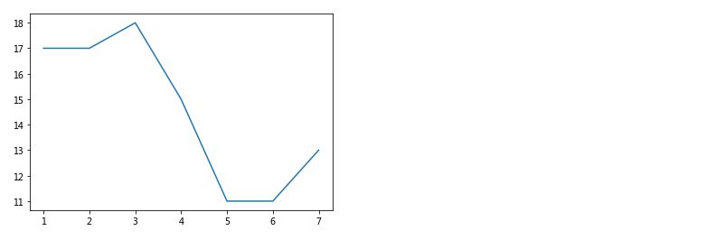
1 简单画图
下图可用于展现一周的天气情况
# 创建画布
plt.figure()
# 绘制图像
plt.plot([1, 2, 3, 4, 5, 6, 7], [17, 17, 18, 15, 11, 11, 13])
# 保存图像
plt.savefig("1.png") # 用于导出图片
# 显示图像
plt.show()
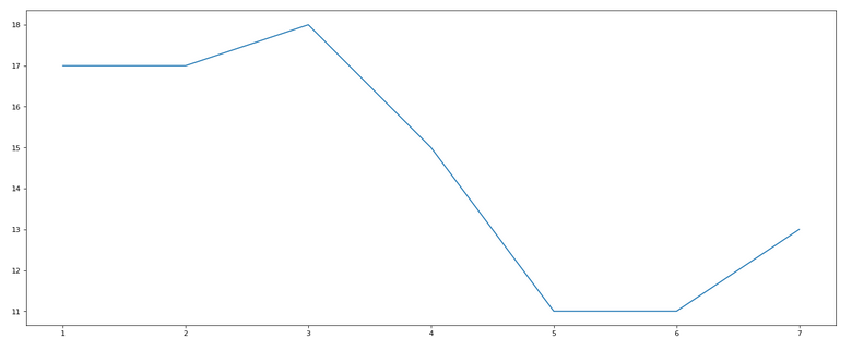
2 改变画布大小与清晰度
通过figsize和dpi 调整画布
# 创建并调整画布
plt.figure(figsize=(20, 8), dpi=80) # 设置画布大小与清晰度
plt.plot([1, 2, 3, 4, 5, 6, 7], [17, 17, 18, 15, 11, 11, 13])
plt.show()
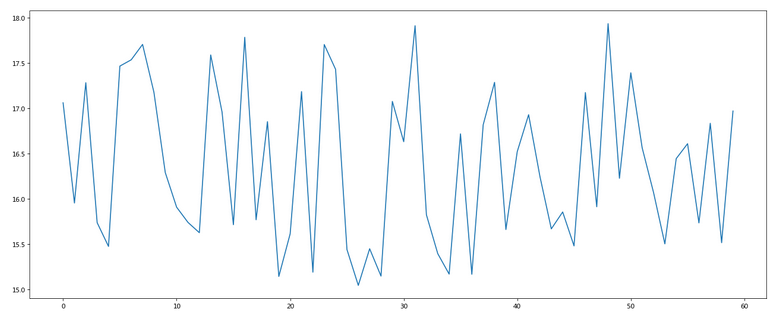
3 使用随机数据
例如画出某上海11点到12点1小时内每分钟的温度变化折线图,温度范围在15度~18度
#  准备数据 x和y,随机生成
x = range(60) # 60个点
y = [random.uniform(15, 18) for i in x] #用random包生成60个均匀分布uniform的随机数
plt.figure(figsize=(20, 8), dpi=80)
plt.plot(x, y)
plt.show()
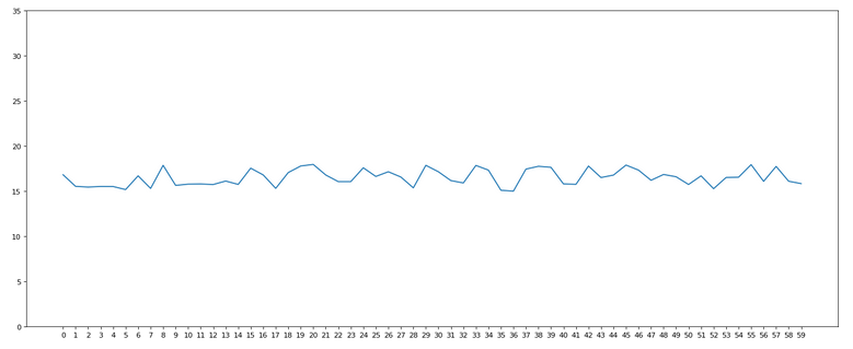
4 设置XY轴
跟上图相比,增加XY轴的格式
x = range(60) # 60个点
y = [random.uniform(15, 18) for i in x]
plt.figure(figsize=(20, 8), dpi=80)
plt.plot(x, y)
# 设置X和Y轴
plt.xticks(x) # x轴每分钟显示一次
plt.yticks(range(0, 40, 5))#增加Y轴,数值从0-40,每隔5显示一次
plt.show()
5 美化X轴设置
X轴以中文,间隔时间显示
x = range(60)
y = [random.uniform(15, 18) for i in x]
plt.figure(figsize=(20, 8), dpi=80)
plt.plot(x, y)
# 美化X轴设置
x_label = ["11点{}分".format(i) for i in x] #设置x轴格式
plt.xticks(x[::5], x_label[::5]) #每隔5显示一次
plt.yticks(range(0, 40, 5))
plt.show()
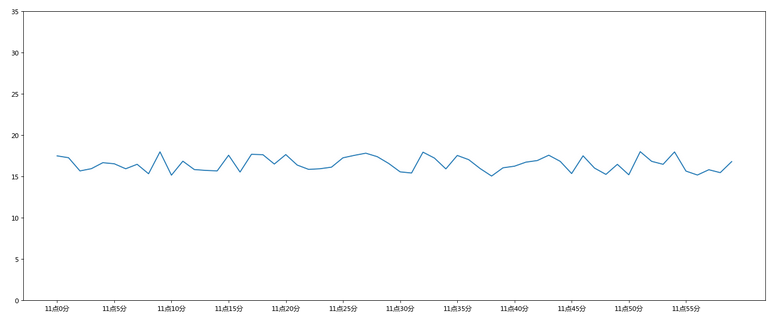
6 显示网格
在图背景中显示网格
x = range(60) # 60个点
y = [random.uniform(15, 18) for i in x]
plt.figure(figsize=(20, 8), dpi=80)
plt.plot(x, y)
x_label = ["11点{}分".format(i) for i in x]
plt.xticks(x[::5], x_label[::5])
plt.yticks(range(0, 40, 5))
# 添加网格显示
plt.grid(True, linestyle="--", alpha=0.5) #true让它显示网格(true也可以删除),网格类型linestyle设为--的虚线,透明度alpha设为0.5
plt.show()
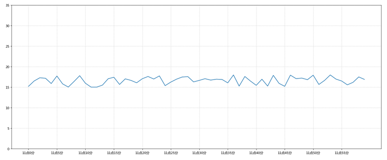
7 设置标签与标题信息
添加x和y轴以及标题信息
x = range(60)
y = [random.uniform(15, 18) for i in x]
plt.figure(figsize=(20, 8), dpi=80)
plt.plot(x, y)
x_label = ["11点{}分".format(i) for i in x]
plt.xticks(x[::5], x_label[::5])
plt.yticks(range(0, 40, 5))
plt.grid(True, linestyle="--", alpha=0.5)
# 添加描述信息
plt.xlabel("时间变化")
plt.ylabel("温度变化")
plt.title("上海11点到12点每分钟的温度变化状况")
plt.show()
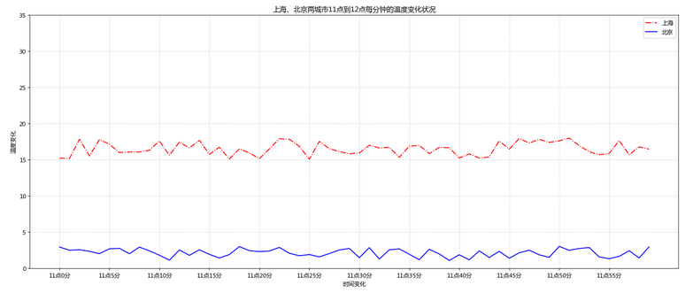
8 增加另一条折线
再添加一个城市北京的温度变化,北京的温度在1度到3度
x = range(60)
y_shanghai = [random.uniform(15, 18) for i in x]
# 增加数据
y_beijing = [random.uniform(1, 3) for i in x] # 增加了B城市数据,1-3之间
plt.figure(figsize=(20, 8), dpi=80)
# 绘制两条折线
plt.plot(x, y_shanghai, color="r", linestyle="-.", label="上海")# 上海折线设为红色虚线
plt.plot(x, y_beijing, color="b", label="北京") # 北京折线设为蓝色实线
# 显示图例
plt.legend()
x_label = ["11点{}分".format(i) for i in x]
plt.xticks(x[::5], x_label[::5])
plt.yticks(range(0, 40, 5))
plt.grid(linestyle="--", alpha=0.5)
plt.xlabel("时间变化")
plt.ylabel("温度变化")
plt.title("上海、北京两城市11点到12点每分钟的温度变化状况")
plt.show()
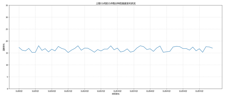
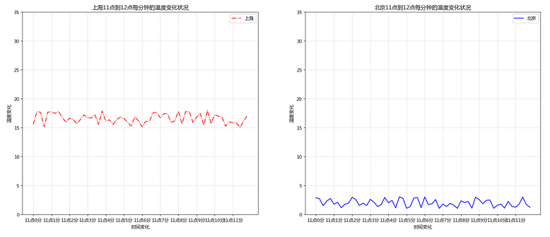
9 两条折线分两个子图显示
调用plt.subplots函数将两条折线分两个子图显示
x = range(60)
y_shanghai = [random.uniform(15, 18) for i in x]
y_beijing = [random.uniform(1, 3) for i in x]
# 创建多个子图,nrows=1, ncols=2代表1行两列
figure, axes = plt.subplots(nrows=1, ncols=2, figsize=(20, 8), dpi=80)
# 绘制图像,axes[0]代表第一个绘图区,axes[1]代表第二个绘图区,
axes[0].plot(x, y_shanghai, color="r", linestyle="-.", label="上海") #
axes[1].plot(x, y_beijing, color="b", label="北京")
# 显示图例
axes[0].legend()
axes[1].legend()
# 修改x、y刻度,分别设置两个子图的坐标
x_label = ["11点{}分".format(i) for i in x]
axes[0].set_xticks(x[::5])
axes[0].set_xticklabels(x_label)
axes[0].set_yticks(range(0, 40, 5))
axes[1].set_xticks(x[::5])
axes[1].set_xticklabels(x_label)
axes[1].set_yticks(range(0, 40, 5))
# 添加网格显示
axes[0].grid(linestyle="--", alpha=0.5)
axes[1].grid(linestyle="--", alpha=0.5)
# 添加描述信息
axes[0].set_xlabel("时间变化")
axes[0].set_ylabel("温度变化")
axes[0].set_title("上海11点到12点每分钟的温度变化状况")
axes[1].set_xlabel("时间变化")
axes[1].set_ylabel("温度变化")
axes[1].set_title("北京11点到12点每分钟的温度变化状况")
plt.show()
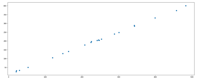
绘制散点图
#  准备数据
x = [225.98, 247.07, 253.14, 457.85, 241.58, 301.01,  20.67, 288.64,
       163.56, 120.06, 207.83, 342.75, 147.9 ,  53.06, 224.72,  29.51,
        21.61, 483.21, 245.25, 399.25, 343.35]
y = [196.63, 203.88, 210.75, 372.74, 202.41, 247.61,  24.9 , 239.34,
       140.32, 104.15, 176.84, 288.23, 128.79,  49.64, 191.74,  33.1 ,
        30.74, 400.02, 205.35, 330.64, 283.45]
#  创建画布
plt.figure(figsize=(20, 8), dpi=80)
#  绘制散点图
plt.scatter(x, y)
#  显示图像
plt.show()
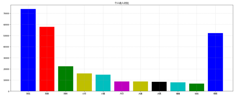
绘制柱状图
# 准备数据
names = ['阿花','阿草','阿树','小月','小星', '大白','大黄','大黑','嘻嘻','哈哈','嘿嘿']
tickets = [73853,57767,22354,15969,14839,8725,8716,8318,7916,6764,52222]
# 创建画布
plt.figure(figsize=(20, 8), dpi=80)
# 绘制柱状图
x_ticks = range(len(names))
plt.bar(x_ticks, tickets, color=['b','r','g','y','c','m','y','k','c','g','b'])
# 修改x刻度
plt.xticks(x_ticks, names)
# 添加标题
plt.title("个人收入对比")
# 网格显示
plt.grid(linestyle="--", alpha=0.5)
# 显示图像
plt.show()
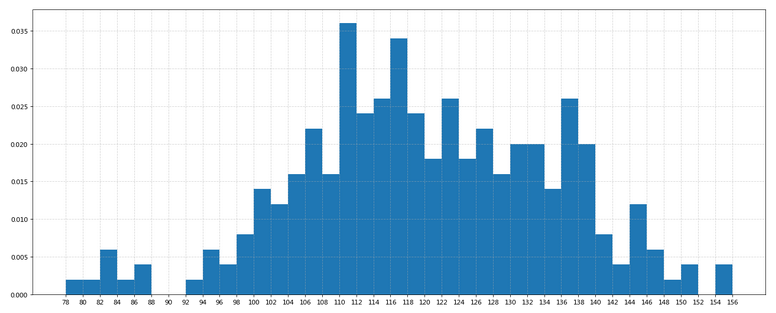
绘制直方图
# 准备数据
time = [131,  98, 125, 131, 124, 139, 131, 117, 128, 108, 135, 138, 131, 102, 107, 114, 119, 128, 121, 142, 127, 130, 124, 101, 110, 116, 117, 110, 128, 128, 115,  99, 136, 126, 134,  95, 138, 117, 111,78, 132, 124, 113, 150, 110, 117,  86,  95, 144, 105, 126, 130,126, 130, 126, 116, 123, 106, 112, 138, 123,  86, 101,  99, 136,123, 117, 119, 105, 137, 123, 128, 125, 104, 109, 134, 125, 127,105, 120, 107, 129, 116, 108, 132, 103, 136, 118, 102, 120, 114,105, 115, 132, 145, 119, 121, 112, 139, 125, 138, 109, 132, 134,156, 106, 117, 127, 144, 139, 139, 119, 140,  83, 110, 102,123,107, 143, 115, 136, 118, 139, 123, 112, 118, 125, 109, 119, 133,112, 114, 122, 109, 106, 123, 116, 131, 127, 115, 118, 112, 135,115, 146, 137, 116, 103, 144,  83, 123, 111, 110, 111, 100, 154,136, 100, 118, 119, 133, 134, 106, 129, 126, 110, 111, 109, 141,120, 117, 106, 149, 122, 122, 110, 118, 127, 121, 114, 125, 126,114, 140, 103, 130, 141, 117, 106, 114, 121, 114, 133, 137,  92,121, 112, 146,  97, 137, 105,  98, 117, 112,  81,  97, 139, 113,134, 106, 144, 110, 137, 137, 111, 104, 117, 100, 111, 101, 110,105, 129, 137, 112, 120, 113, 133, 112,  83,  94, 146, 133, 101,131, 116, 111,  84, 137, 115, 122, 106, 144, 109, 123, 116, 111,111, 133, 150]
# 创建画布
plt.figure(figsize=(20, 8), dpi=80)
# 绘制直方图
distance = 2
group_num = int((max(time) - min(time)) / distance)
plt.hist(time, bins=group_num, density=True)
# 修改x轴刻度
plt.xticks(range(min(time), max(time) + 2, distance))
# 添加网格
plt.grid(linestyle="--", alpha=0.5)
# 显示图像
plt.show()
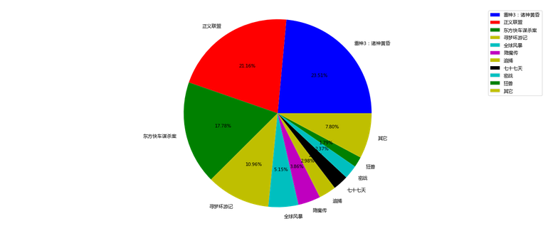
绘制饼图
# 准备数据
movie_name = ['雷神3:诸神黄昏','正义联盟','东方快车谋杀案','寻梦环游记','全球风暴','降魔传','追捕','七十七天','密战','狂兽','其它']
place_count = [60605,54546,45819,28243,13270,9945,7679,6799,6101,4621,20105]
# 创建画布
plt.figure(figsize=(20, 8), dpi=80)
# 绘制饼图
plt.pie(place_count, labels=movie_name, colors=['b','r','g','y','c','m','y','k','c','g','y'], autopct="%1.2f%%")
# 显示图例
plt.legend()
plt.axis('equal')
# 显示图像
plt.show()
后记
matplotlib是一个python广泛熟悉的包,在可视化上发挥着重要的作用,网上关于它的资料已经多如繁星了,matplotlib官方网站也提供了非常多的信息,它的gallery有非常多的模板可供使用。本文的作用在于入门。以上就是用matplotlib画图的基础。本次学习参考了Python教程4天快速入手Python数据挖掘的视频教程,可以下载到课程的code,便于学习。